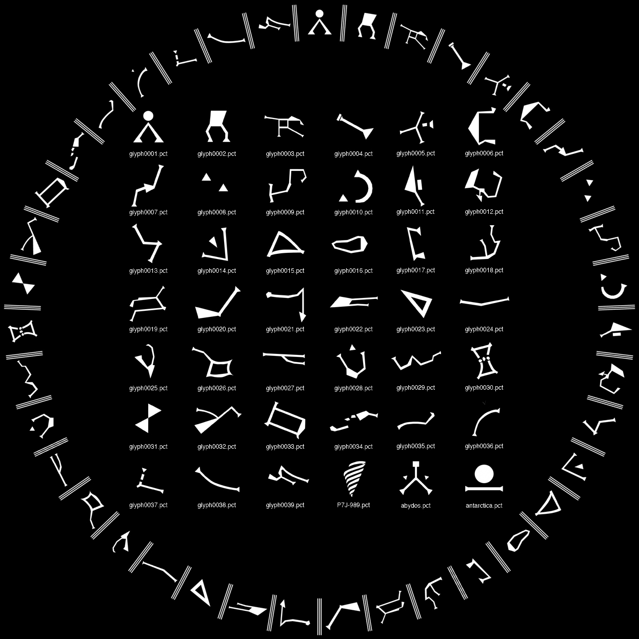
There are several gate drawings, e.g. this simple svg, and this more detailed one. They have subtly different artwork.
A simple example from that is Pegasus which shows in different orientations and with or without an extra point/triangle.


Whilst the orientation actually on the gate should be fixed and defined, when shown as a gate address or symbol on a playing card, the orientation is more flexible. I have gone for the way it would be at the top of the gate. But that does not explain the subtly different designs.
Another orientation issue is Gemini, which shows in different orientations. In the above examples, they are almost the same, but in the third example, it is aligned with the ring rather than at an angle.


One site, stargate.wikia.com, has a good set of glyph SVGs. But its idea of Pegasus has the extra point/triangle :-
So I tried to work out if there had been different versions of the gates, which meant watching the original film, and episodes from several series of SG-1. All are the same, even series 10 opening credits show clearly no extra point/triangle on Pegasus. There are differences in the CGI in the opening credits though which may be a clue. Interestingly the film has the same constellations but again slightly different artwork, but still basically the same as the series.
Even today, at gatecon in Vancouver, they are doing photos with a green screen and gate in the background. One occasions to see a high res photo of a gate, and it has no extra point/triangle!
I think, however, I have found the source of the "wrong" glyphs, the book Stargate SG-1 The Ultimate Visual Guide (of which I have now obtained a copy). On page 10 they show the gate and glyphs in detail :-
Though even page 12, which has actual pictures of the gate, contradicts the drawing on page 10. You'll also note that symbols like Piscis Austrinus are shown with outline rather than filling in artwork, where as the gate does not have outlines like that.
So, I think my glyphs are actually correct, and the right way around (as would be viewed at the top of the gate).
Of course, if these cards ever get launched there will be fans saying I have it wrong. Par for the course I guess.
P.S. The glyphs on the screens in Stargate command are different to the gate! So this is another source of the different style:-
P.P.S I found some excellent work here... "...I went back to the Gate used on the show, and created my glyphs from that primary reference, making this list more accurate in both shape and orientation of each Glyph..." - these match my glyphs nicely.


Perhaps it's a trap street? https://en.wikipedia.org/wiki/Fictitious_entry
ReplyDeleteThank you for taking the time to do this, I've been tearing my hair out trying to get useful reference images from episode recordings.
ReplyDelete